Fintap Logo

About the product
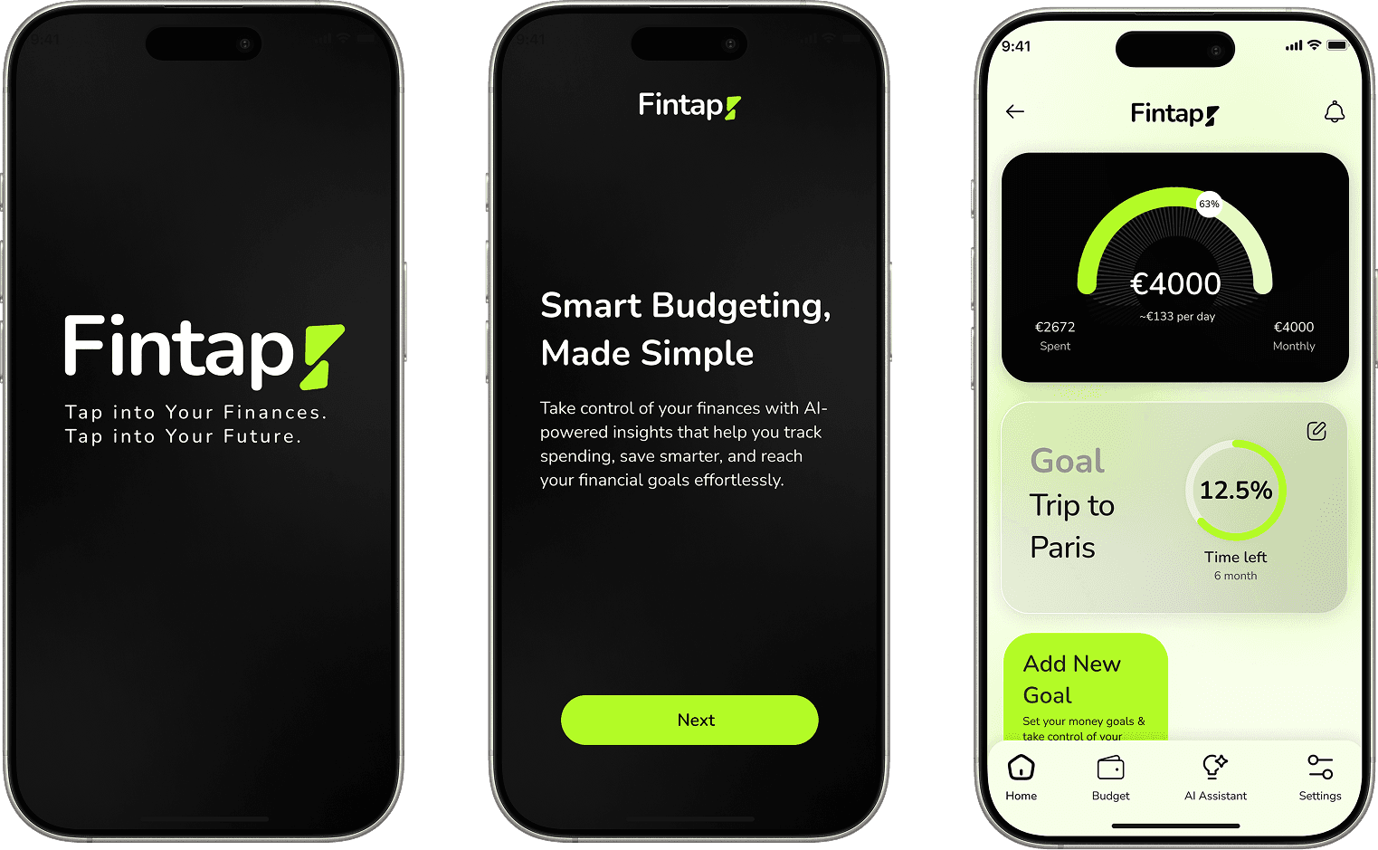
Fintap is an AI-powered budgeting app designed to help students track expenses, set savings goals, and make smarter financial decisions.
With real-time insights and a user-friendly experience, Fintap empowers young adults to take control of their finances effortlessly.

Challenges
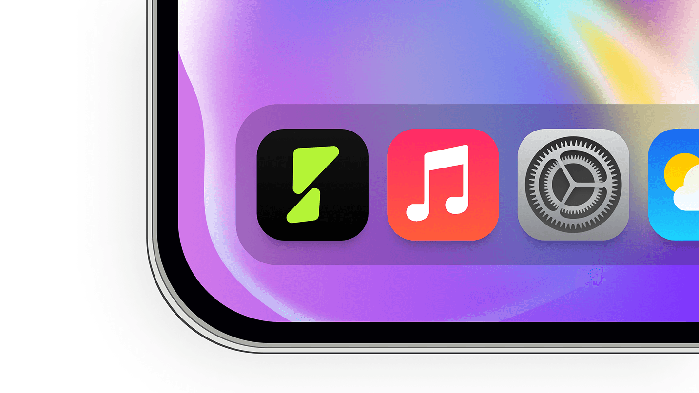
Designing the Fintap logo required balancing simplicity, uniqueness, and meaning in a competitive fintech space. The challenge was to create a symbol that effectively represents financial growth and stability while remaining minimalistic and modern. Choosing the right shape and color was crucial — the design needed to feel trustworthy, fresh, and engaging for students. Additionally, scalability was a key consideration, ensuring the logo remains clear and impactful across different digital platforms.
My approach
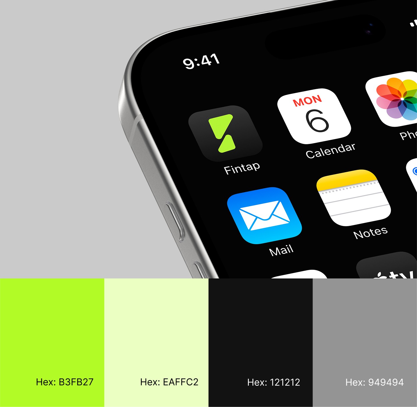
I designed the Fintap logo using two triangles to form the letter "F," symbolizing growth, ambition, and direction — core elements of smart financial management. The choice of lime green was intentional, representing fresh starts, energy, and financial well-being, while maintaining a modern and approachable feel. The minimal design ensures versatility, making the logo adaptable for various applications while keeping it recognizable and meaningful. By merging geometry, color psychology, and functionality, I tried to create a visual identity that aligns with Fintap’s mission of making budgeting simple, smart, and empowering.